How to turn your 8 Google Analytics dashboard metrics into boat loads of insights

Most people skip this screen, but you shouldn’t
This dashboard is the first thing you see when you open Google Analytics.
At first glance, these eight metrics provide you with a simple overview of your website and doesn’t convey many insights.
However, these metrics carry some of the most crucial information for starting your analytics journey. Spending 10 minutes or so analyzing these metrics can not only give you quick and valuable insights but also guide you through the rest of your analysis.
In this article, we have divided these eight metrics into three categories. Within each category we will discuss three questions:
What can these eight metrics tell us about your website?
How do you get quick insights from these eight metrics?
How do you use these eight metrics to guide further analysis?
These eight metrics can answer three major business questions
The brief sketch below illustrates the three major business questions those metrics can answer.
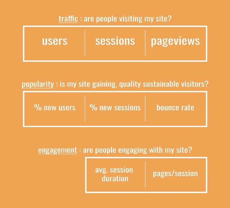
In the graph, the eight metrics are divided up into the following categories, with each answering a different business question:
Traffic (Users, Sessions, Pageviews): Are people visiting my website?
Popularity (%New Users, % New Sessions, and Bounce Rate): Is my site gaining sustainable, quality visitors every day
Engagement (Pages/Session, Avg. Session Duration): Are users engaging with my website
Let’s now go into each category to understand the metrics better.
“Traffic” metrics are the first indicator of whether your website has problems.
The first category is the “traffic.” This category gives you an overview of your traffic based on all three units of analyses.
As briefly mentioned in my previous article (link here), without additional settings, Google Analytics collects and aggregate data on three levels: Users, Sessions, and Pageviews.
Each of the three metrics in this category (traffic) correspond to each of the levels and tell you something different about your web traffic.
More specifically, the “Users” metric collects the number of unique users visiting your website during the selected period; the “Sessions” metric collects the number of sessions these users partake in; the “Pageviews” metric illustrates the number of pages those users visits in total.
Insight Guide
To get insights from your traffic data, you need to 1) compare traffic metrics across time, and 2) separate business signals from random noise.
Comparing Traffic Across Time
Although the three metrics in this category are helpful, by themselves, they fall under the category of “vanity metrics.” That is, they are metrics that don’t provide any real value to analysts because they lack context
For example, if you had 1000 users visit your website in the past seven days that may seem good but you don’t really know unless you compare it to a standard., You can fix this by placing the number within context. If you had 900 users in the previous seven days, 1000 is a good number. If you had 1100 visitors in the previous seven days, then 1000 is a bad number.
To avoid the situation described above, make sure you compare changes across time.
You can accomplish this by using the “comparing timeframe” feature in Google Analytics. The relevant screen is pictured below and instructions to accomplish this are linked here.
When choosing time periods, I recommend using past 7 days as your unit of choice. Anything smaller is vulnerable to small variations in behavior.

Separate Business Signals from Noise
Distinguishing between “signals and noises” is important because we don’t want to take actions when actions are unwarranted.
The easiest way to identify signals from noises is to look further back in time and determine whether the changes are present across multiple time periods.
How this guides future analyses
If any of these three metrics vary significantly across time, then you either have a problem or an opportunity. To figure out which one it is, you need to spend more time on that particular “unit of analysis” to discern what is causing the change.
For example, if you see a drastic increase in your user count over the past few weeks, you might want to focus your investigations on users and identify which specific demographic segment is fueling the increase.
“popularity” metrics can tell you whether your websites are getting sustainable, quality visitors.
The “popularity” category is closely related to the “traffic” category but all three metrics in this category focus on whether your website is gaining sustainable and quality traffic.
The first two metrics, % new sessions and % new users, help you understand whether your traffic level is sustainable.
However, sustainability is not enough to measure popularity. A website may have 90% more new users every day but if most of those visitors come onto the website and leave without performing any actions recordable by Google Analytics (this is the definition of “bounce”), then that 90% number means little
That’s why we also take into account the “bounce rate.” “Bounce rate” measures the percentage of sessions that “bounced” as described above and serves as a great indicator of whether the traffic on your site is quality traffic.
Insight Guide
My first recommendation is always to “compare across time”. But since we’ve already covered that, we’re instead going to focus on two analytical techniques that will help you better understand your popularity with visitors: 1) rate benchmarking and 2) duality of “% new sessions” and “% of new users.”
Rate Benchmarking
All metrics in this category are all rates which is great because they can all be benchmarked according to a standard. This is an easy and effective way to understand how your website is doing.
For “% new sessions” and “% new users,” somewhere around 70% is a good number to hit. As for the bounce rate, anything around or under 50% is productive.
However, it is essential to recognize that benchmarks are just suggestions and your metrics might differ drastically depending on your industry, the purpose of your website, and the way your content is laid out.
For example, if you have a one-page website and aren’t tracking any events on it, it’s very likely that your bounce rate is going to approach 100%. That’s okay; it’s all about context.
Metric Duality
I want to focus on one potential caveat when analyzing “% new sessions” and “% new users.”
These two metrics are, by nature, ambiguous. A high % of new users may mean that more new users are visiting your website but it also may mean that less old users are returning to your website.
Therefore, it is imperative to recognize the duality of these two metrics during your analysis and to be careful when making conclusions such as “we are getting a lot of new users”, or “we have failed to engage returning visitors”.
Similar caveats apply to bounce rate. A high bounce rate may mean two things: you are getting the wrong type of users to visit your website or your website’s design is not appealing or trustworthy enough for quality users to continue using it.
How this guides future analyses
Although you can’t make definite conclusions from most of the analyses in this category, the two points explained above can still drive your future analyses in ways that will help you figure out what is actually happening. Here are two examples:
1) When “% new session” or “% new users” are far above or below the benchmark (without a clear reason why), you should focus your analysis on “new vs old visitors” session under audience->behavior section of Google Analytics. and look at the bounce rate, conversion rate, and engagement rate differences between the two groups (I wrote a guide here to help you do so).
2) When your bounce rate is higher than 50% (and you are a site that wants users to view content that is beyond the first page), you need to focus your analysis on the following two areas.
(a) The first place is the attribution -> channels session in Google Analytics. This will help you understand where your users are coming from. If the source (i.e. channel) of your website visitors (whether that’s Google search keywords, social media posts, or referral sites) are not aligned with the content (i.e. text) of your website, you need to adjust your channels to align with your website content.
For example, if your homepage is all about a health product called “gorilla bars” but you are putting up cute gorilla videos on your social media in order to draw traffic to your site, users are not going to be engaged.
(b) On the other hand, if your channel and content are aligned you need to examine your home page and identify what elements of it may make users feel that your website is untrustworthy. Improve those elements to provide a better user experience.
“Engagement” metrics can tell you whether users are having positive experiences on your website.
The previous two categories describe user behavior before they begin engaging with your site.
The “engagement” category provides more information by collecting information on two very helpful metrics — Avg. session duration and pages/session. These show more about how engaged visitors are while visiting your website.
You might have already realized that pages per session can be calculated by dividing pageviews by sessions. While simple, this is a powerful metric that’s great at showing how engaged visitors are on your site.
However, visitors aren’t very engaged if they visit 5 pages in a single session but only spend 1 second on each of these pages. That’s why we added avg. session duration to the mix.
Insight Guide
As usual, identifying changes in these metrics over time is the first thing you should do. But in order, to get the full value out of them you need to identify relevant benchmarks.
For these two metrics, it is very hard to identify out-of-the-box benchmarks because websites are so varied in terms of content length and page depth.
A good way of coming up with benchmarks for these metrics is to follow this procedure:
Map out potential user journeys on your website
Sit down and click through those theoretical journeys making sure to both (1) record the number of pages you browse through and (2) use a stopwatch to record the time you spend on your website carrying out those tasks.
Compile those time, summarize and average them, and that’s your benchmark.
You can go through this procedure by yourself or have people do it for you. Whatever strategy you pick, the point of this analysis is to give you a general idea of what your average pages per session and session duration should be.
How they guide future analyses
If the two metrics collected by Google Analytics are dramatically different than what you got through your benchmark process, it means that some pages in your website are preventing users from making their way deeper into their journey.
There are two types of analyses you can do to identify those pages.
The first analysis is page-level analysis, which can be found under the behavior -> all pages section of Google Analytics. Here, you can identify pages with high exit rate and low time on page. These are the pages that you need to optimize.
Secondly, you need to conduct a user flow analysis under the behavior -> behavior flow section to see whether users are following the path you had foreseen for them.under each specific behavior below, which page is dropping off the most from, and optimize the said page. Change the website flow based on the visitors recorded behavior.
Conclusion
In this article, we examined the eight basic metrics in Google Analytics and discussed how to use these metric to do real and valuable analysis.
Another thing you may have realized is that Google Analytics does not do a great job of laying those metrics out for the analyses I have described above.
That’s why, at Humanlytics, we have started by redesigning the main dashboard of Google Analytics. An example of our improved dashboard is shown below.
We’re starting by reorganizing the metrics according to the categories we described in this article. We are also working on developing an insight-generation engine that much of the analyses described in this article.

The dashboard session of our Google Analytics tool. The whole tool is still under development, and the first edition is due out in early April.
Please let us know in the comment session your feedbacks about our dashboard.
That’s it for our Google Analytics guide this week. We hope it will help you turn your Google Analytics data into actionable business insights. If you have any questions or feedback, please comment below or email me at bill@humanlytics.co or signup for our newsletter via this link
To stay updated on future blog posts, please follow us on Medium at analytics-for-humans or on Twitter and Facebook. If you have any questions about this article, please feel free to email me at bill@humanlytics.co.
This blog is produced by Humanlytics. At Humanlytics, we are making tools to make Data Analytics easy, compelling, and valuable for all businesses. If you want to learn more about Humanlytics, please visit our site at humanlytics.co.